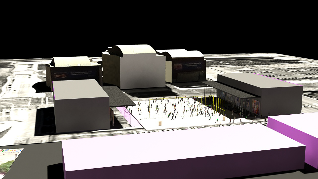
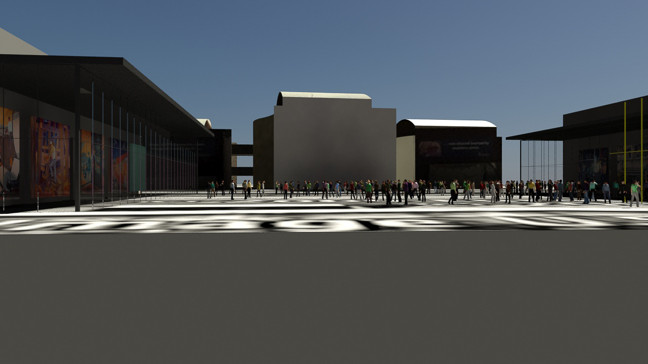
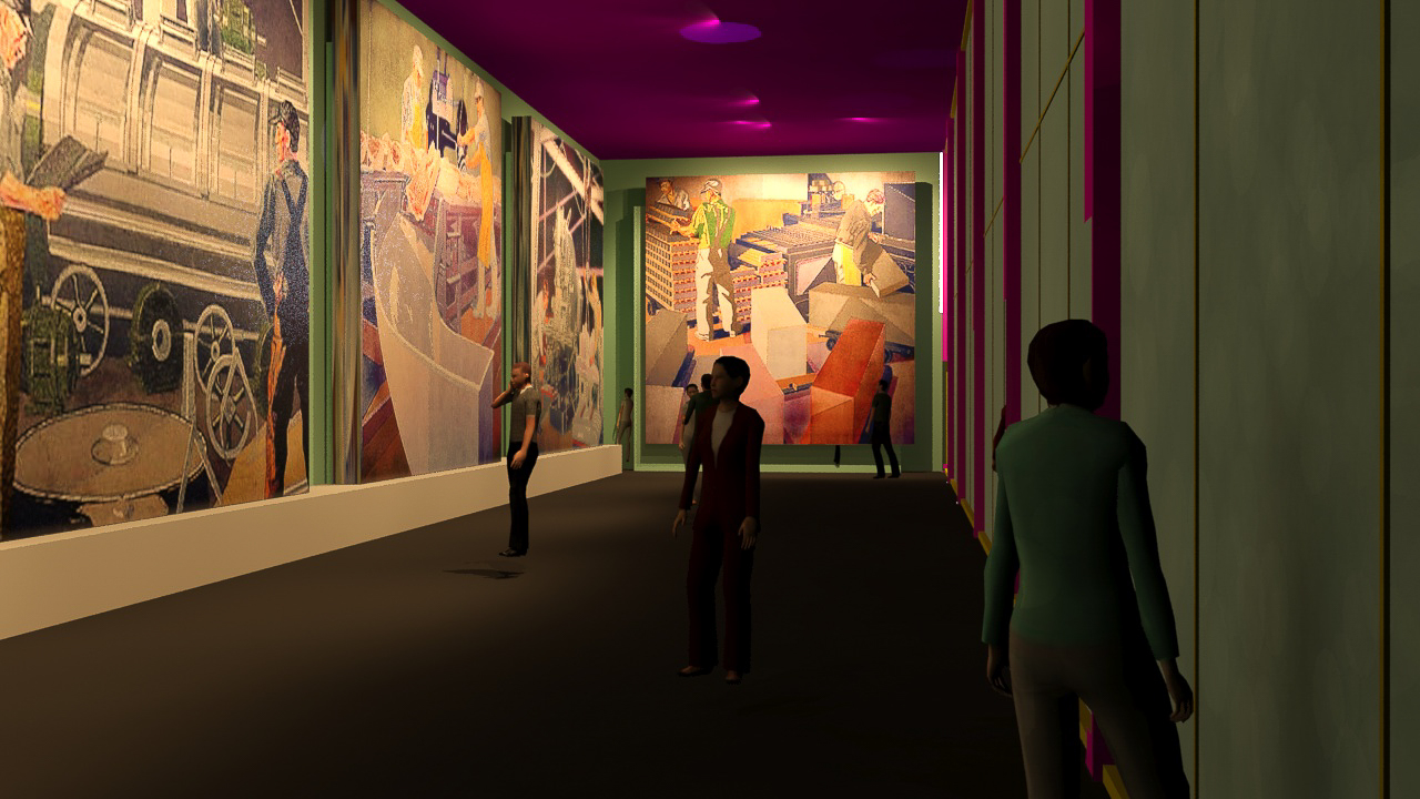
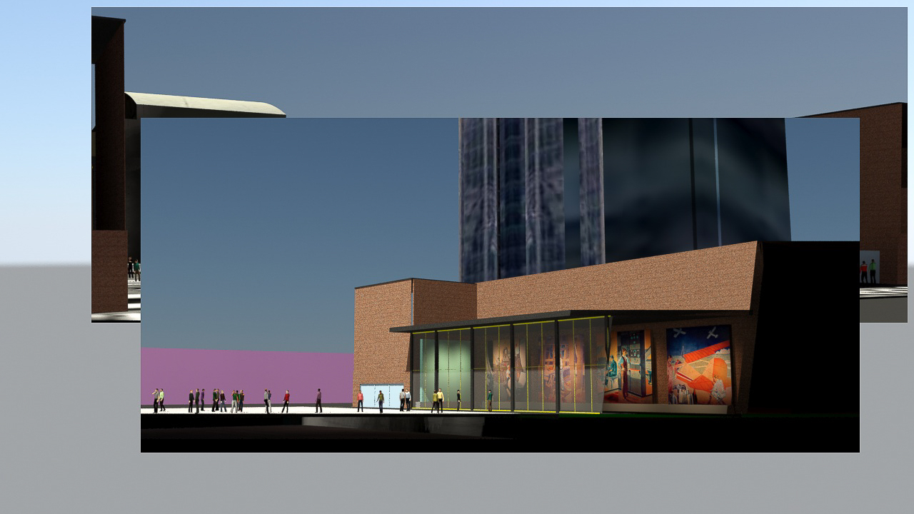
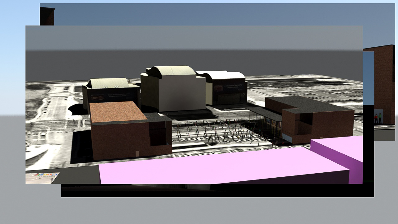
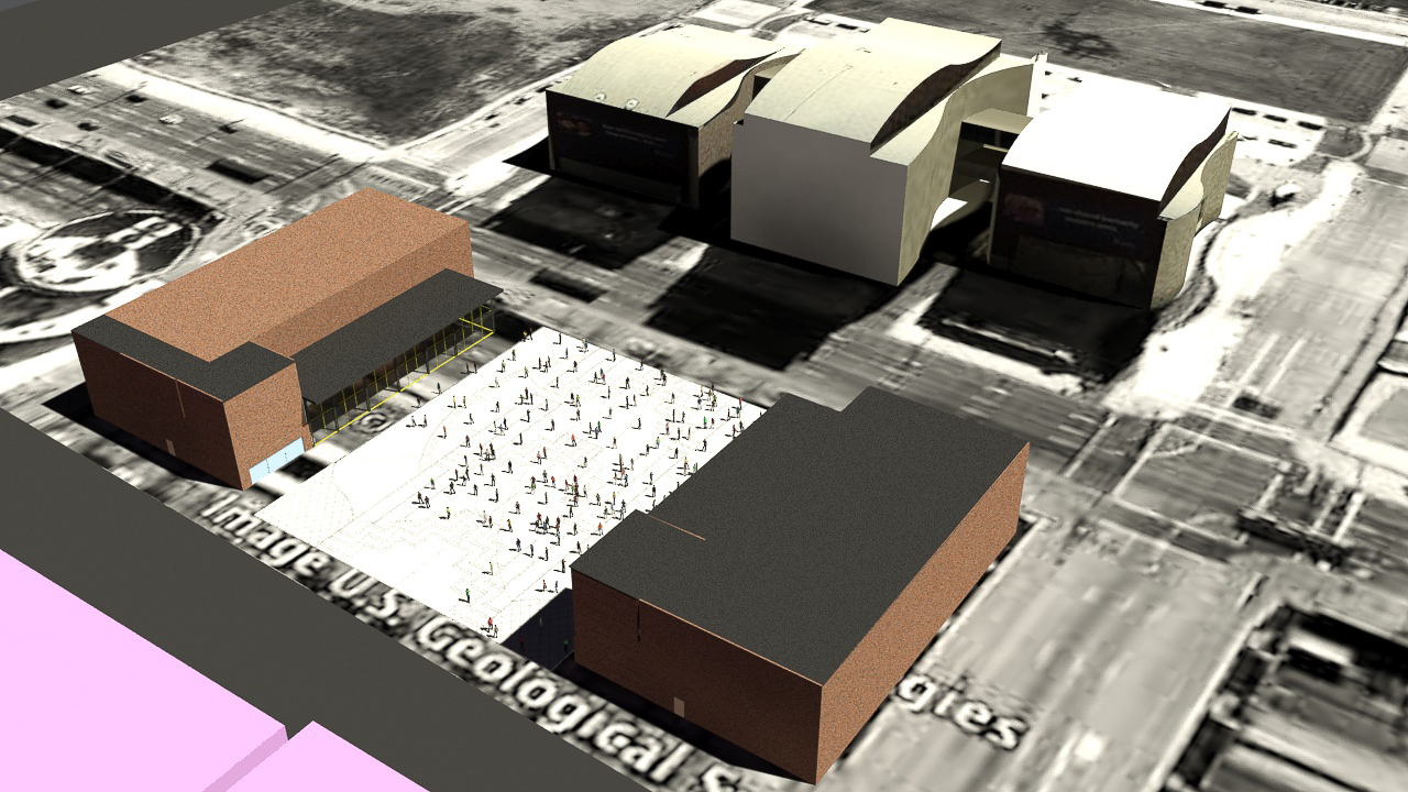
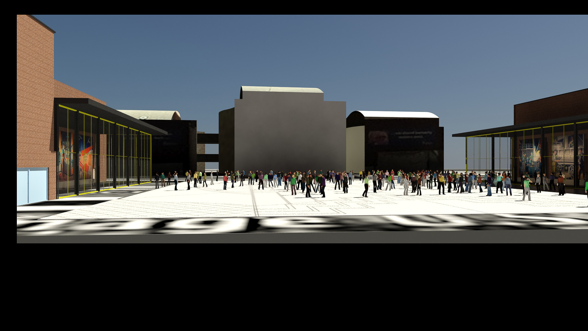
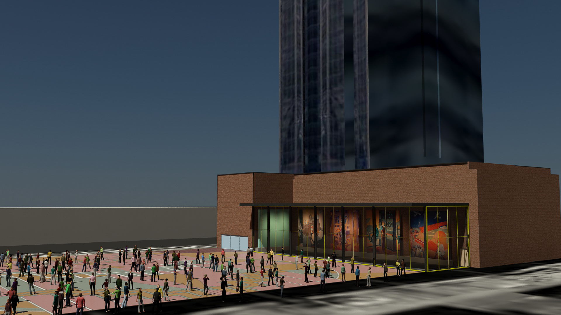
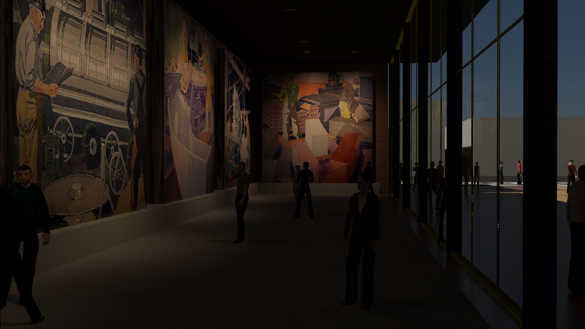
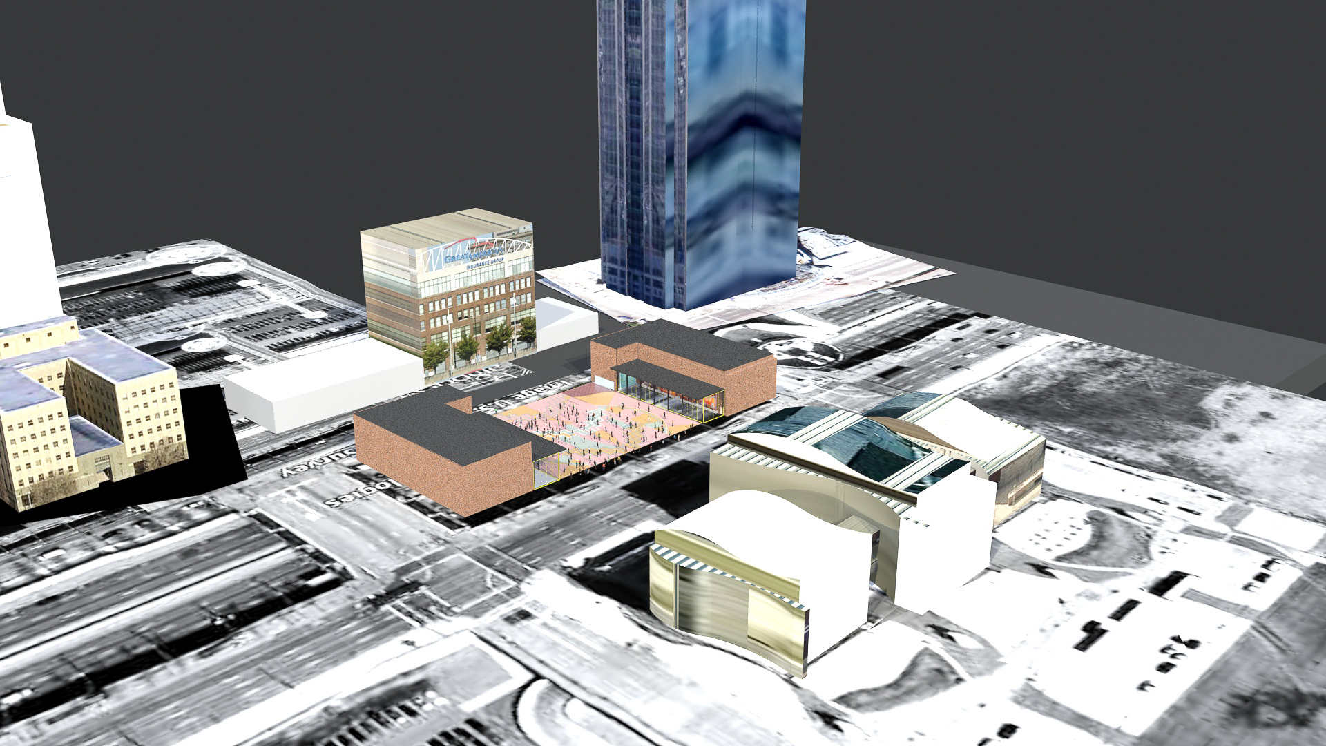
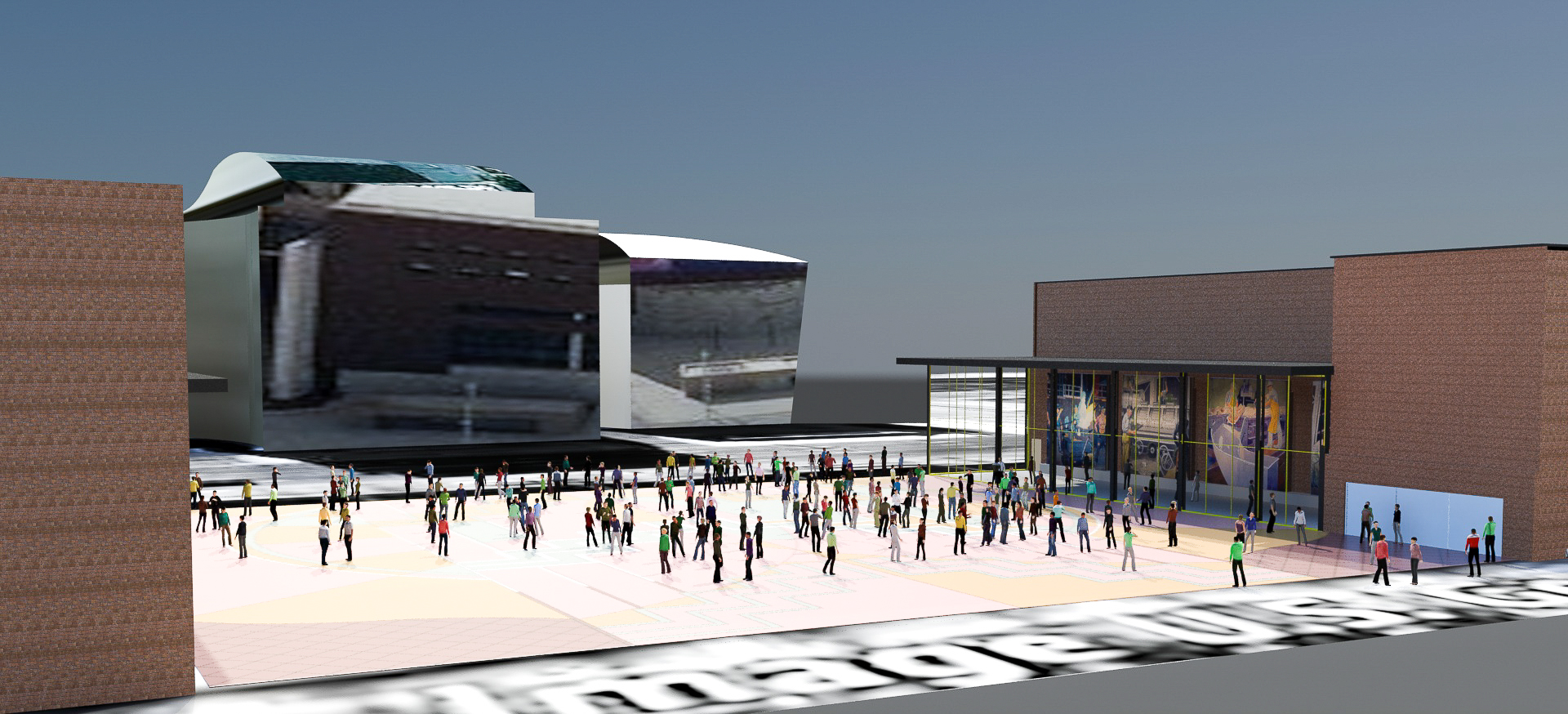
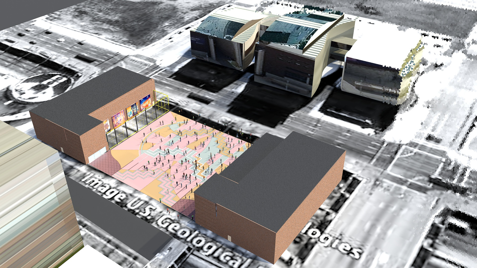
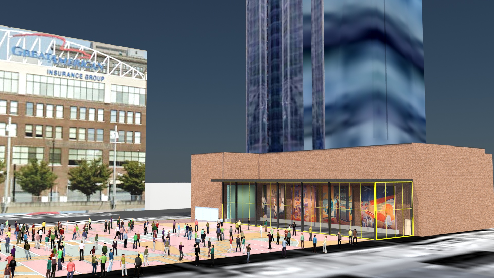
A Building with a Rich History
Read MorePainting Gallery
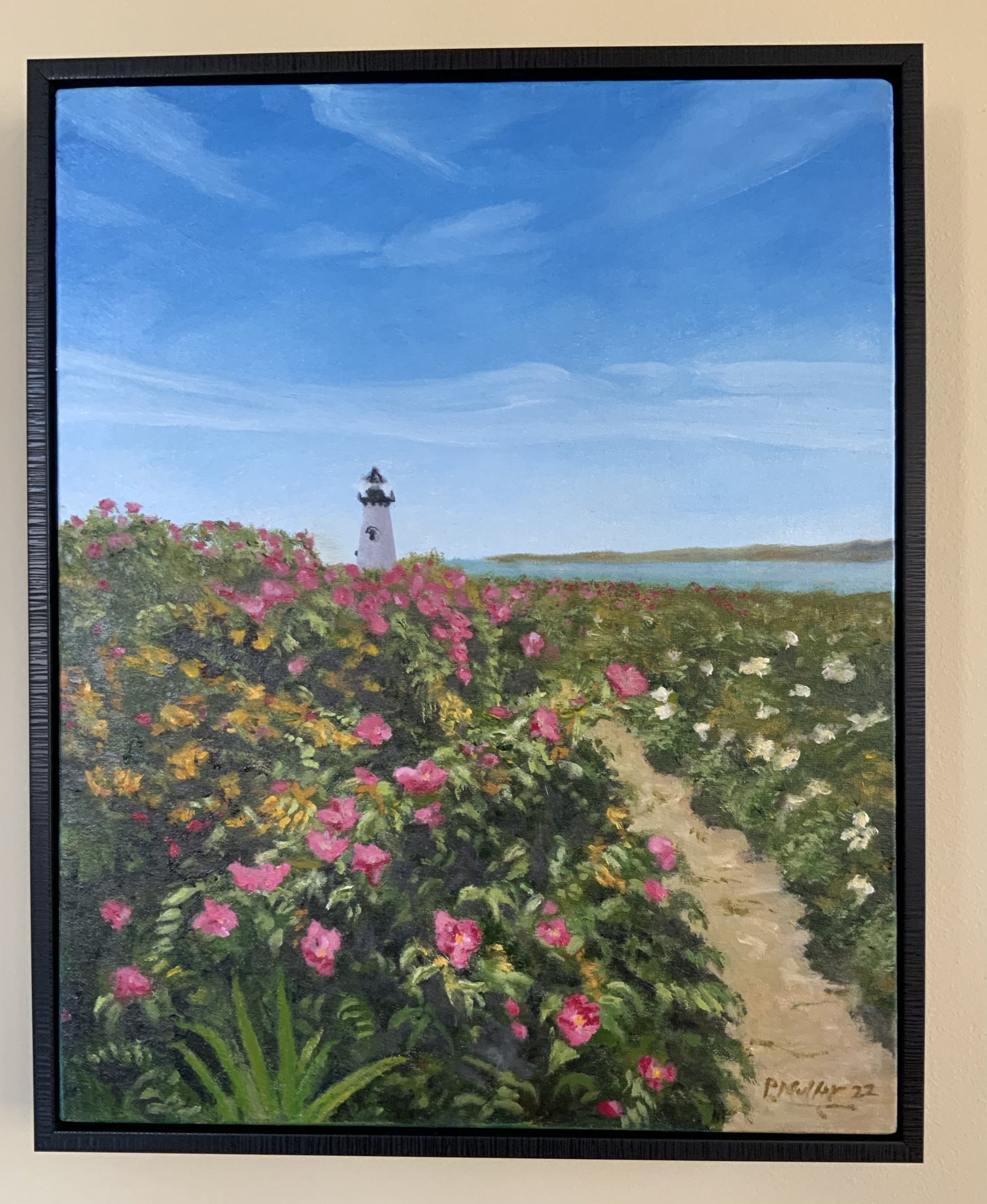
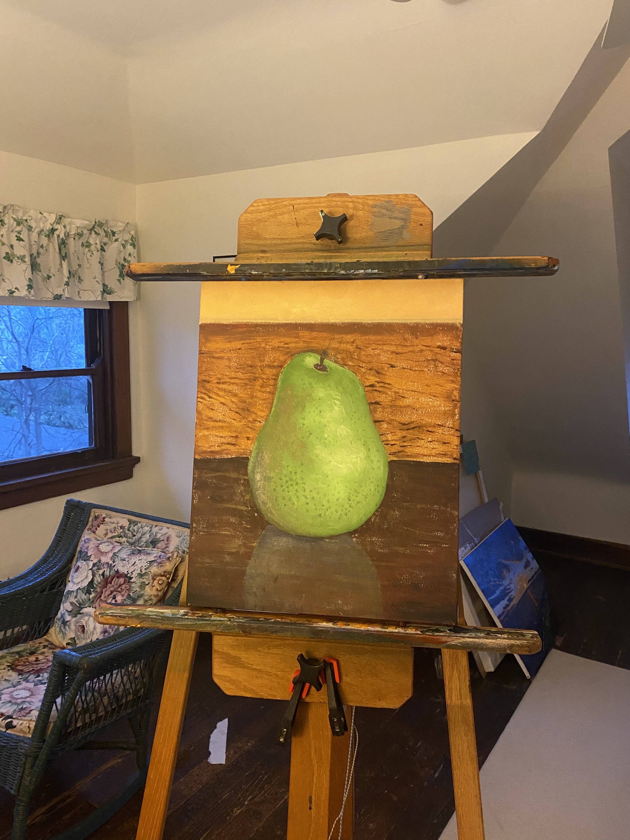
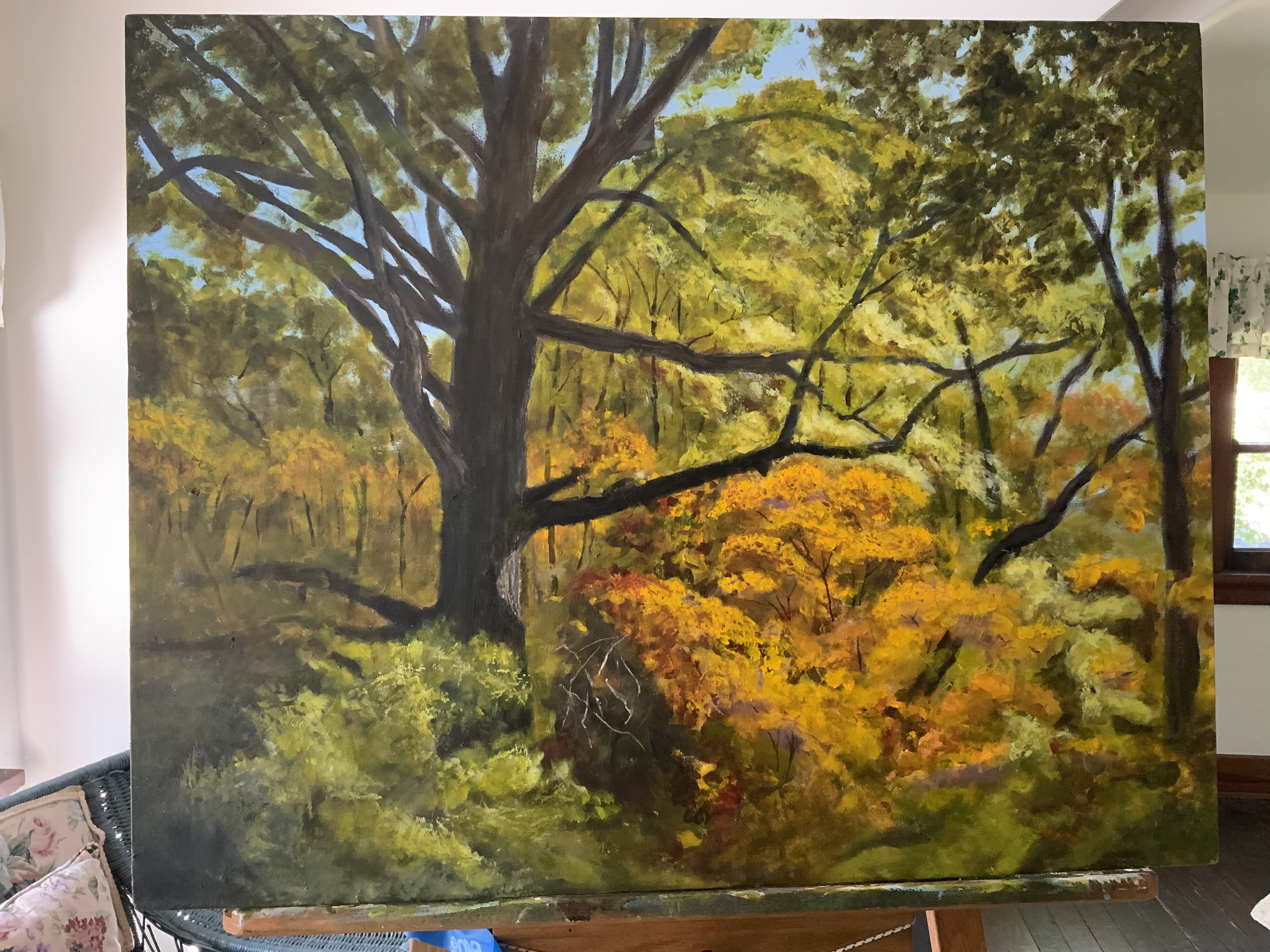
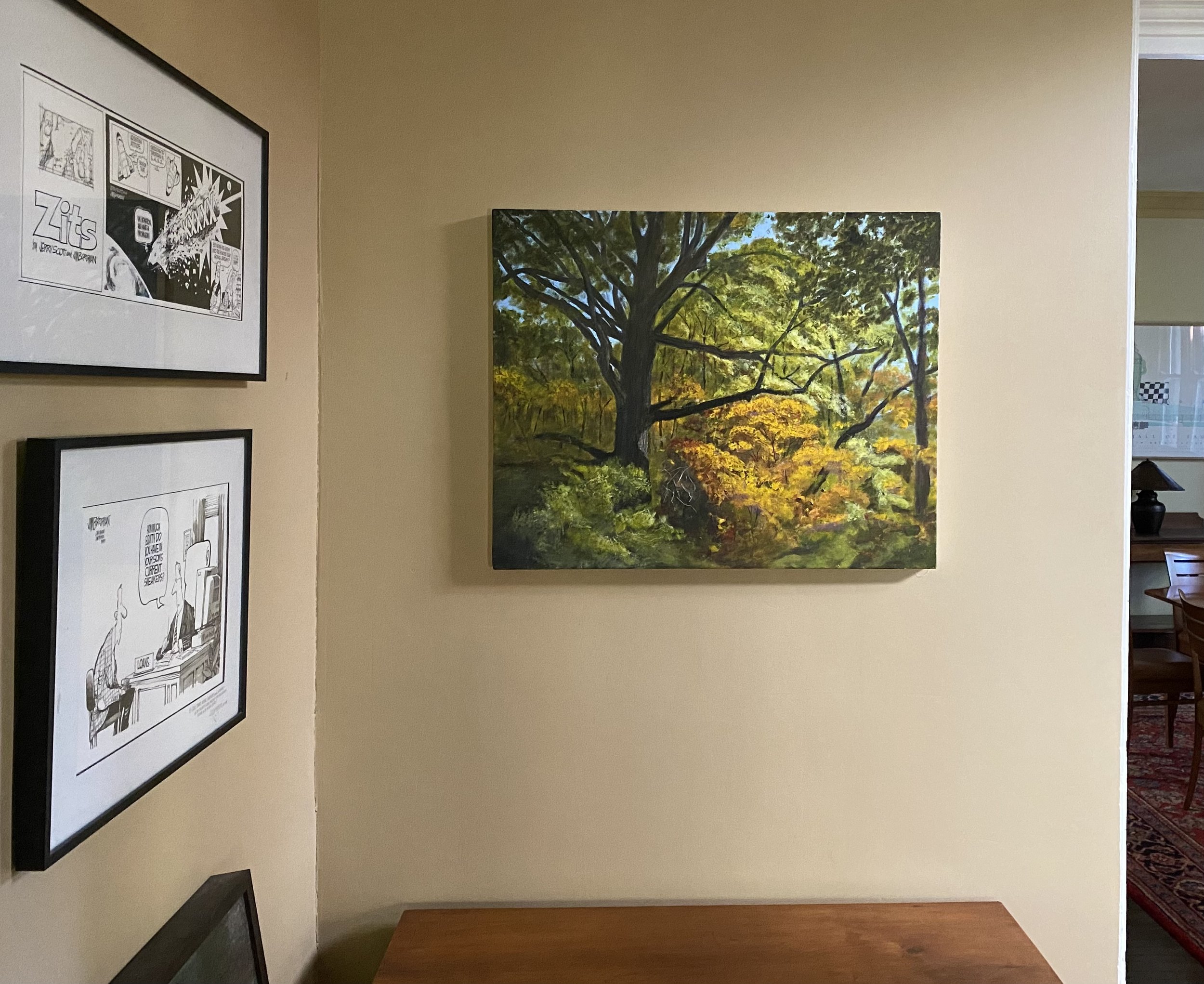
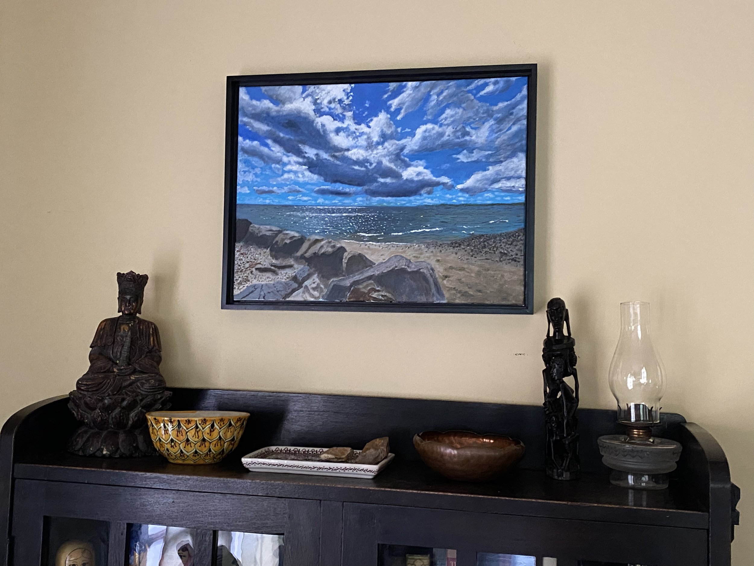
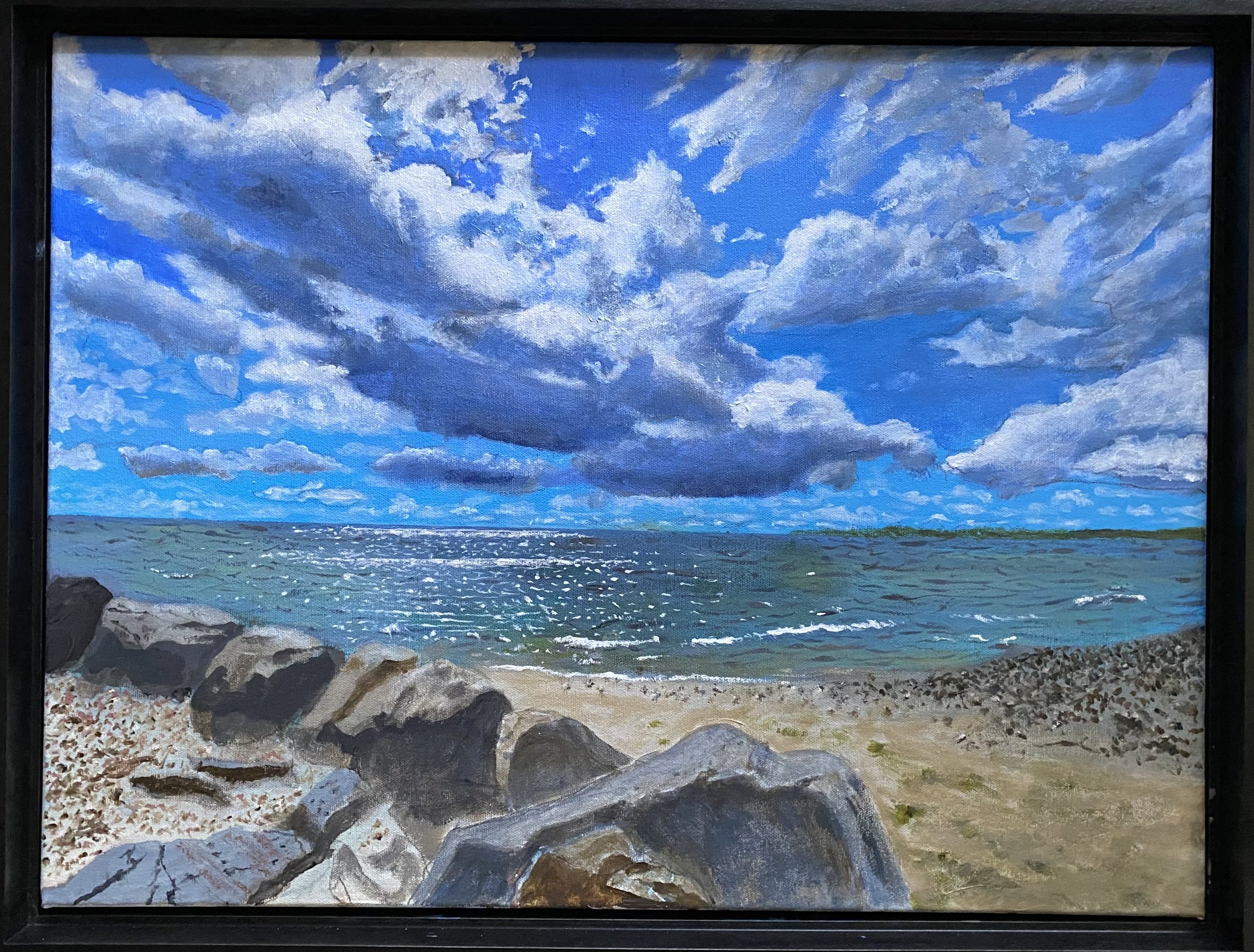
Some recent paintings:
Happy birthday Alexander Calder!
Notes on the Exhibition 'Calder Lightness' at the Pulitzer Arts Foundation May - September 2015
Calder's birthday was July 22, (or maybe August 22) in 1889. I am taking this as an occasion to write about an extraordinary exhibition of his work last year at The Pulitzer Arts Foundation. ‘Calder Lightness’ was one of three exhibitions which reopened the Pulitzer after being closed to construct additional exhibition space. Tadao Ando, the architect for the original building, created new exhibition space within his 2001 design.
The Calder exhibition that was part of the reopening is a striking example of what art and architecture can do for each other. As you entered the building you were greeted by a diminutive early Calder sitting on a low base. His early works may not yet evolved the flight of the later mobiles but they did have all the wit, balance and spacial presence of the later work.
Several large mobiles filled the stair hall, illuminated with rich natural light Tando Ando infused into the spaces. In the Pulitzer, Ando worked with every kind of light, indirect and diffused, reflected, even crisp, high contrast sunlight beams at some well controlled slices within the building.
Seen on axis, they mobiles were perfectly spaced, each with enough distance to be experienced on its own terms, yet close enough to others to form a grander composition. Photographs of Calder's own studio show that, at times, he had created this overlapping, energetic effect with a number pieces in limited space. At the Pulitzer they align along the long axis of the upper hall. The Calders can be viewed individually from the side and when viewed on axis, they overlap and formed a delightful vista.
Additional individual pieces were displayed in galleries, sometime by themselves. This provided a viewer the chance to walk around the Calder, to see it within a space that fills. The shear number of Calder works assembled for the exhibition was one of its strengths. They came from around the world and I was very happy to see his mobile for the Terrace Plaza Hotel in Cincinnati Twenty Leaves and an Apple, 1946 was included as a loan from the Cincinnati Art Museum.
Sorry to be telling you about this wonderful exhibition so long after it’s gone but you can see the photographs on the Pulitzer Arts Foundation site at: Calder Lightness
On a final note, museum design has a long history of wrestling with the question of balance between the museum’s artistic presence and the obligation to present works of art to their best advantage. How much design, aesthetic character, personally and point of view can an art museum have while still enhancing the work of artists displayed within? The answer is a lot as the Calder exhibition at the reopened Pulitzer Arts Foundation showed so beautifully.
Paul Muller, AIA
Work in Progress
fww decks
Signs at the Cincinnati Art Museum
Original Post: August 18, 2010
There are signs of life at the Cincinnati Art Museum. There are also signs of neon fish, blinking lights, and Big Boys. The installation in the Art Museum’s ambulatory represents collaboration between ArtWorks and the American Sign Museum. ArtWorks: The American Road is a refreshing inclusion of popular culture icons in the Art Museum. And this is not a first, the cars at the entry indicated a openness to wider taste cultures. There was a time when the division between high art and popular culture was a battle line with turf staunchly defended on both sides. After the work of Andy Warhol , Robert Venturi and Steve Izenour this restrictive view seems limiting and quaint. The selection of Aaron Betsky as director in 2006 gave the museum the intellectual elbow room to open the windows and let some signs, cars and propellers blow in. Mr. Betsky’s credentials as a serious commentator and critic are widely recognized. This allows the Museum the freedom to explore a wider range of cultural phenomena without risking their commitment to excellence. They said only Nixon could go to China, so is it only Betsky could go to pop?
A second exhibit at the Cincinnati Art Museum bridges cultural taste levels in a fascinating way. “Vegas 360” by Cincinnati photographer Thomas R. Schiff presents otherworldly images of Las Vegas. The landscape is both familiar and alien as the panoramic photos bend and warp the lines of buildings, signs, and ceilings. It is a wonderland of neon and flashing lights. Grids become parabolic roller coasters and you can become lost in the depth of the photographs. There is a scene populated with a crowd that looks as if an entire civilization has been created for the photo. I was torn between feeling that I was witnessing an ancient festival or futuristic gathering on another planet. I guess that’s what you might expect when you combine roman sculpture, neon excess and a 360 degree camera in Thomas Schiff’s hands. Allowing the viewer to see the familiar in new ways has been a powerful theme in art. Thomas Schiff achieves this in a surprising number of ways with just a few photographs. If this alien world exists somewhere, I want a ticket.
A second exhibit at the Cincinnati Art Museum bridges cultural taste levels in a fascinating way. “Vegas 360” by Cincinnati photographer Thomas R. Schiff presents otherworldly images of Las Vegas. The landscape is both familiar and alien as the panoramic photos bend and warp the lines of buildings, signs, and ceilings. It is a wonderland of neon and flashing lights. Grids become parabolic roller coasters and you can become lost in the depth of the photographs. There is a scene populated with a crowd that looks as if an entire civilization has been created for the photo. I was torn between feeling that I was witnessing an ancient festival or futuristic gathering on another planet. I guess that’s what you might expect when you combine roman sculpture, neon excess and a 360 degree camera in Thomas Schiff’s hands. Allowing the viewer to see the familiar in new ways has been a powerful theme in art. Thomas Schiff achieves this in a surprising number of ways with just a few photographs. If this alien world exists somewhere, I want a ticket.
Big Boy at the Cincinnati Art Museum
The Cincinnati Art Museum is not alone in calling our attention to signs. Yale University celebrated the 45th anniversary of the "Learning from Las Vegas" architectural studio by Robert Venturi, Denise Scott Brown and Steve Izenour with an international symposium at last year. The book “Learning from Las Vegas, The Forgotten Symbolism of Architectural Form”grew out of the1968 studio at Yale is recognized for transforming the debate about the American visual environment. The work played a pivotal role in reinvigorating architectural design with symbolic content. Today signs are beginning to be appreciated for their rich cultural content and as an intriguing record of the recent past. Cincinnati is very fortunate to be the home of the American Sign Museum and it is heartening to see the collaboration with the Art Museum.
"ArtWorks: The American Road", at the Cincinnati Art Museum - June 22, 2010 - August 29, 2010
"Vegas 360", at the Cincinnati Art Museum - May 1, 2010 - September 26, 2010
A companion book, Vegas 360° features seventy-seven panoramic photographs of the Las Vegas skyline and iconic architecture, an introduction by art critic Dave Hickey and essays from David Surratt, A.D. Hopkins, Douglas Unger, Kim Thomas, Phil Hagen, Benedetta Pignatelli and Matthew O’Brien.
The book is on sale at the Cincinnati Art Museum Shop.
LEED Rating’s Fatal Flaw: Sustainable Buildings, Disposable Workers
2015 Update: The US Green Building Council recently added a "Prevention Through Design" LEED credit. NIOSH and other occupational health organizations worked closely with USGBC in developing this important credit. Worker health and safety is now incentivised by the LEED Rating system. My article which called for such a credit is below.
Can a building project that causes worker deaths be labeled “sustainable”? It seems reasonable that LEED certification of a building indicates it was designed, constructed and operated in a commendable way. It may be reasonable, but it is not always true. There is a glaring omission in the LEED rating system that undermines its legitimacy and leaves construction workers exposed to unnecessary risks. A construction project with preventable worker deaths can achieve a very high rating for sustainability. This raises the question of whether the health and safety of construction workers falls within the mission of the rating system.
Having studied this for some time I believe the only conclusion that is reasonable is that the safety of the workers on the construction site is clearly within the scope of LEED’s mission. It is also clear that it should be a factor in the certification of a building. In fact, the health and well being of people is at the very core of the rating system. As Michael Behm, et al, point out: ”…sustainable design and green buildings must account for both environmental and human resources throughout their lifecycles. Sustainability is a broader concept which, in addition to the environmental aspect, addresses the continuity of economic considerations, resource conservation, and social aspects of human society.” (Note 1)
There are several credits that directly address the health and well the occupants of the buildings. While there are also credits that address VOC’s and other toxic materials on the job site, it is a baffling that the rating system does not include a comprehensive approach to the health and well being of the temporary occupants, the construction workers. Justification for their inclusion can be found in the very first line of the USGBC’s statement of the purpose: “The LEED Green Building Certification Program is a voluntary, consensus-based national rating system for buildings designed, constructed and operated for improved environmental and human health performance.” (emphasis added). The clarity of the mission, with its emphasis on “human health performance”, would seem to support, even compel, consideration of onsite worker safety.
The omission of comprehensive worker health and safety criteria is tragically highlighted in the largest project to achieve Leed Gold certification. City Center in Las Vegas earned six LEED Gold Certifications on a complex in which six construction workers lost their lives. The mega project opened last year and was highly promoted as a success for the LEED rating system. The difficulties on the job site have been widely reported in the news media and were the subject of congressional hearings. The worker fatalities had no apparent impact on the Gold certification that six elements of the project received from the LEED Green Building Certification System. City Center was celebrated as a model of sustainable construction practice. This is clearly not consistent with the LEED mission.
It is important that the USGBC address the omission of a worker safety emphasis. Construction is a highly hazardous industry. Architects are surprised to hear that over 1,000 construction worker deaths occur each year. That rate of about three deaths per day accounts for 20% of worker deaths in a industry that is just 7.5% of the workforce. (Note 1) The good news is that there are known construction methods that prevent injury and death. Companies that make safety an emphasis have achieved very high levels of safety. In other words, we know how to build safely, we just don’t do it on a consistent basis.
While “building green” is rapidly becoming the standard in construction, this approach has not been shown to increase worker safety. In a study published in October 2009 in the Journal of Construction Engineering and Management greener projects, as measured by LEED credits achieved, did not see a statistically significant reduction in safety incidents. (Note 2)
There are two simple steps that can fix the LEED rating system’s safety omission. First, create a system wide prerequisite that a worker death from a preventable construction injury would prohibit certification. This one change would certainly save lives and the attention to prevention of deaths would undoubtedly also save many workers from other serious injuries. Second, LEED should offer a credit for an “Enhanced Worker Safety Plan”. Like many of the credits, this one would reward projects that go beyond recognized standards to achieve greater benefits than required by law. It builds on the strength of the LEED approach of voluntary attainment of higher standards. When the Leed rating is a risk, the motivation to implement the credit requirements is transmitted throughout the job site. Many construction sites have worker safety as a top priority. Those projects would not be penalized by either of the proposed changes. In fact, they would be rewarded. The projects that would lose points or certification would be those where workers safety is compromised. Sounds like a good deal for everyone. These two simple steps would be in the spirit of the underlying Leed Green Building Rating System objectives and would significantly advance worker safety. It is time for the USGBC to weigh in on right side of the age old conflict between cost savings and safety. Improving the “human health performance of buildings” should start with groundbreaking, not on moving in day.
By Paul Muller, AIA, LEED AP
-END-
A sample of a proposed “Enhanced Worker Safety Plan” credit can be found at www.mullerarchitects.com. Feel free to use it on projects now as an Innovative Design Credit. All I ask is that you let me know how it goes and that you share any improvements you make. PM
Note 1: “Prevention through Design and Green Buildings: A US Perspective on Collaboration” CIB W099 Conference 2009
Behm, Michael, Occupational Safety Program, East Carolina University
Lentz, Thomas, National Institute for Occupational Safety and Health
Heidel, Donna, National Institute for Occupational Safety and Health
Gambatese, John, School of Civil and Construction Engineering, Oregon State University
Note 2: “Impact of Green Building Design and Construction on Worker Safety and Health,” by Sathyanarayanan Rajendran, (Construction Safety Supervisor, Hoffman Construction Company, Portland, OR 97205. E-mail: sathy-rajendran@hoffmancorp.com), John A. Gambatese, (Associate Professor, Dept. of Civil, Construction, and Environmental Engineering, Oregon State Univ., 220 Owen Hall, Corvallis, OR 97331 (corresponding author). E-mail: john.gambatese@oregonstate.edu), and Michael G. Behm, (Assistant Professor, Dept. of Technology Systems, East Carolina Univ., 231 Slay Hall, Greenville, NC 27858. E-mail: behmm@ecu.edu)
Journal of Construction Engineering and Management, Vol. 135, No. 10, October 2009, pp. 1058-1066, (doi 10.1061/(ASCE)0733-9364(2009)135:10(1058))
http://cedb.asce.org/cgi/WWWdisplay.cgi?174445
